What the yield curve can signal—and what it cannot predict
Learn what a normal, flat, or inverted Treasury yield curve shows, why investors watch it, and why an inversion is not a recession timetable.
In this guide
An inverted yield curve means that shorter-maturity bonds have higher yields than longer-maturity bonds for the maturities being compared. A normal curve usually slopes upward: investors demand, or the market prices, higher yields for longer commitments. A flat curve means the difference is small. These shapes describe prices and yields across maturities; they are not a countdown clock for the economy.
The U.S. Treasury publishes daily par yield curve rates for multiple maturities. The curve is therefore a market observation, not a single official interest rate. The useful question is not simply “Is it inverted?” but “Which maturities, which securities, on what date, and why might that spread have changed?”
The curve in one picture
Scroll sideways or use arrow keys to read the full table.
| Shape | Basic description | Possible information | What it does not establish |
|---|---|---|---|
| Normal / upward sloping | Longer maturities yield more than shorter maturities | Compensation for time, inflation uncertainty, growth expectations, or term premium may be higher | That growth or inflation must rise |
| Flat | Yields are similar across the selected maturities | The market’s pricing of the term difference is compressed | That a turning point is certain |
| Inverted | Shorter maturities yield more than longer maturities | Policy expectations, expected slowing, demand for longer debt, or term-premium changes may be involved | That a recession is guaranteed or imminent |
The same day can show different shapes depending on whether you compare three months with ten years, two years with ten years, or another pair. “The yield curve” is shorthand for a family of maturity spreads.
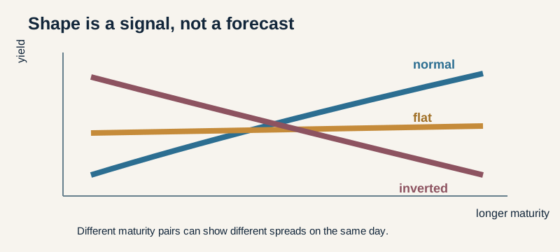 Normal, flat, and inverted describe selected maturity relationships; they are not forecasts.
What a yield curve actually measures
A Treasury yield is the market’s annualized return convention for a security at a particular maturity and price. A yield curve plots comparable yields against time to maturity. Treasury’s daily table includes maturities from very short bills through 30-year securities, with its own methodology and conventions.
The curve does not directly display a central bank’s forecast. It reflects the prices of securities that trade in a market where participants consider expected policy rates, inflation, economic activity, supply and demand, liquidity, and compensation for holding duration and other risks. Those forces can point in different directions.
This is why a curve shape is best treated as a summary of market pricing. It is evidence to interpret, not a message written by a single forecaster.
Why an inversion gets attention
Short-term yields are often sensitive to the expected path of overnight policy rates. Long-term yields reflect expected future short rates plus compensation for holding a longer-maturity security. If markets expect current policy to be restrictive and later rates to be lower, short yields can rise above long yields. Strong demand for longer Treasuries can also lower long yields, and changes in term premium can alter the slope without a simple one-to-one story about growth.
Federal Reserve research has examined yield-curve slopes as inputs to recession-probability models. That research is useful precisely because it models uncertainty: different spreads, controls, horizons, and term-premium assumptions can produce different results. A signal can contain information without providing a guaranteed date or cause.
What “inverted” does not mean
It is not a guaranteed recession
An inversion can precede recessions in historical U.S. data, but a historical association is not a law that forces the next outcome. Federal Reserve commentary has explicitly cautioned that an inversion does not necessarily mean a recession is beginning. The economy can continue expanding while the curve is flat or inverted, and other shocks can dominate the signal.
It is not a precise timer
Even when an inversion is followed by a downturn, the gap between the observation and the event can vary. A reader who asks “How many months until recession?” is asking for a forecast that the curve alone cannot provide. Models need a definition of recession, a horizon, a chosen spread, and a data vintage.
It is not a trading instruction
The curve does not tell you to buy long-duration bonds, sell equities, hold cash, or change an allocation. Those decisions depend on goals, horizon, liquidity, taxes, credit exposure, and the possibility that the curve will move again before a thesis plays out. Duration, explained in the bond duration guide, describes price sensitivity—not the direction of the next curve move.
It is not the same as every other curve
The Treasury curve compares government securities with a particular credit and liquidity profile. Corporate, municipal, mortgage, and swap curves can have different spreads and behavior. A curve inversion in one market or maturity pair does not automatically describe every borrower’s financing conditions.
Three mechanisms that can produce a similar shape
An inverted curve can arise through several combinations:
- Restrictive near-term policy pricing. Investors price higher short-term rates because policy is tight or expected to remain tight.
- Lower expected future short rates. Longer yields fall because markets expect slower activity, lower inflation, or eventual policy easing.
- Strong demand or a lower term premium. Longer securities become expensive relative to their cash flows, lowering their yields even without a simple recession narrative.
These are not mutually exclusive. The curve itself does not identify which mechanism dominates. That requires looking at other data, including inflation, labor markets, financial conditions, credit spreads, and the policy outlook—and even then, interpretation remains uncertain.
Observation, expectation, and cause are different layers
It helps to keep three statements separate. First, an observation: the selected short yield is above the selected long yield. Second, an expectation: market participants may be pricing lower future policy rates or weaker activity. Third, a causal claim: the inversion will cause a recession. The first can be measured directly from a dated table. The second is an interpretation of prices and other evidence. The third requires a model and can still be wrong.
The distinction also protects against hindsight. After an economic downturn, commentators can point back to an earlier inversion and make the signal sound inevitable. Before the outcome is known, investors face alternative explanations, changing data, and a market that may already have incorporated public information. A curve can flatten because short yields fall, long yields rise more slowly, or both move at once. The same label can conceal very different changes in level and expectations.
Why data choice matters
Treasury’s par curve is a model-based set of rates derived from market information, not a list of identical bonds all trading at the same time. Treasury publishes its methodology and updates the table as new observations arrive. A researcher using a different data source may use on-the-run securities, fitted zero-coupon rates, futures, or a forward spread. Those are related but not interchangeable.
Data revisions and the observation time matter too. A curve seen at the market close can differ from an intraday curve. A later revision can change a historical comparison. If you are reading a chart in an article, check its source, date, maturity pair, frequency, and whether the series is a spot yield, a par yield, a forward rate, or a spread. Precision in the label is more valuable than a dramatic headline.
What the curve can add to a broader dashboard
The curve is one input among several. A reader can place it beside inflation trends, labor-market conditions, lending standards, credit spreads, financial stress, and central-bank communications. None of these inputs is a complete forecast. Together they can help explain why a market is repricing risk or policy expectations.
For an individual bond, the curve is still only a starting point. The issuer’s credit spread may widen even when Treasury yields fall. A callable bond’s expected cash flows can change. A fund can carry fees, turnover, and holdings that do not match the maturity pair used in a headline. Context improves a question; it does not turn a broad signal into a personalized answer.
A simple spread example
Assume, purely for illustration, that a two-year Treasury yield is 4.80% and a ten-year yield is 4.20% on the same date and under the same source conventions. The ten-year minus two-year spread is:
4.20% − 4.80% = −0.60 percentage points, or −60 basis points.
That is an inverted two-to-ten-year spread. It tells you the selected long yield is 60 basis points below the selected short yield at that observation. It does not tell you why the market priced the spread that way, whether it will persist, or when the economy will turn.
Change the maturities, date, security type, or data revision and the conclusion can change. Never mix a Treasury par yield with a different source’s bond price or a corporate yield and call the result one curve.
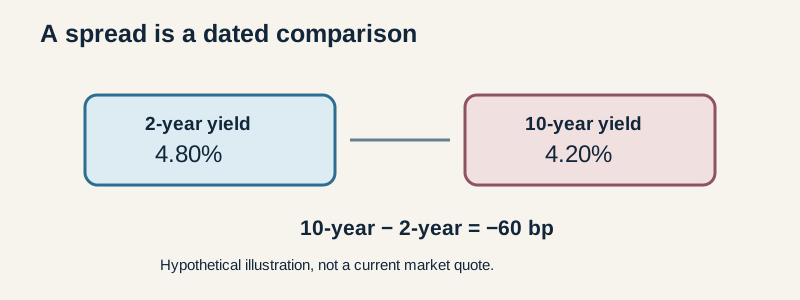 Hypothetical example only; a spread is a dated comparison, not a recession prediction.
How to read a curve without overclaiming
Use a disciplined sequence:
- Name the source and date. Treasury’s daily table and methodology define the observation.
- Name the maturities. “Inverted” is incomplete without the two points or the selected curve segment.
- Check the units. A 0.60 percentage-point spread equals 60 basis points, not 0.60 basis points.
- Separate observation from explanation. The slope is observed; the cause is an interpretation.
- Check other evidence. Inflation, employment, credit conditions, and policy communications can add context but do not eliminate uncertainty.
- Avoid live-data theater. If an article does not show a current table and timestamp, do not imply that it does.
Curve shape versus your bond’s risk
The curve is a market-context tool. It does not replace analysis of a specific bond or fund. A portfolio’s duration, credit spread, callable cash flows, currency, liquidity, and fees can dominate its result. Two portfolios can have similar maturity averages but different price sensitivity and credit exposure.
Likewise, an investor who holds an individual high-quality bond to maturity may experience market-price changes differently from an investor in a continuously traded bond fund. The curve can inform the context, but it cannot supply the investor’s holding-period return.
The idea to keep
An inverted yield curve says one narrow but important thing: for the maturities compared, short-term Treasury yields are above long-term yields. It can be a useful signal about market pricing and expectations. It cannot, by itself, guarantee a recession, identify a date, explain a single cause, or tell you what to buy.
Continue through the Bonds & Rates learning path to connect curve signals with duration, credit risk, and bond cash flows.
This U.S.-oriented educational guide does not report a current yield-curve reading, recession probability, market forecast, or personalized recommendation. Historical and model-based research is uncertain evidence, not a promise.